classpass is the easiest way to book all things fitness, wellness & beauty on the go
but prior to 2016, the only way to get recommendations and easily rebook classes was from a desktop computer, which didn’t make sense when the majority of our users were app power users.

-
lead product designer, partnering with our research and engineering teams.
journey mapping, prototyping, testing, visual design, QA. -
Our main goal was to introduce and reconnect users to a wider set of experiences they might enjoy. As well as allowing ClassPass to flexibly merchandize studios.
We knew that we had to create a living organism that flexed based on a users tenure, workout patterns, and willingness to explore. Visually, we had to make it an engaging experience that would convince people to step out of their usual routine.
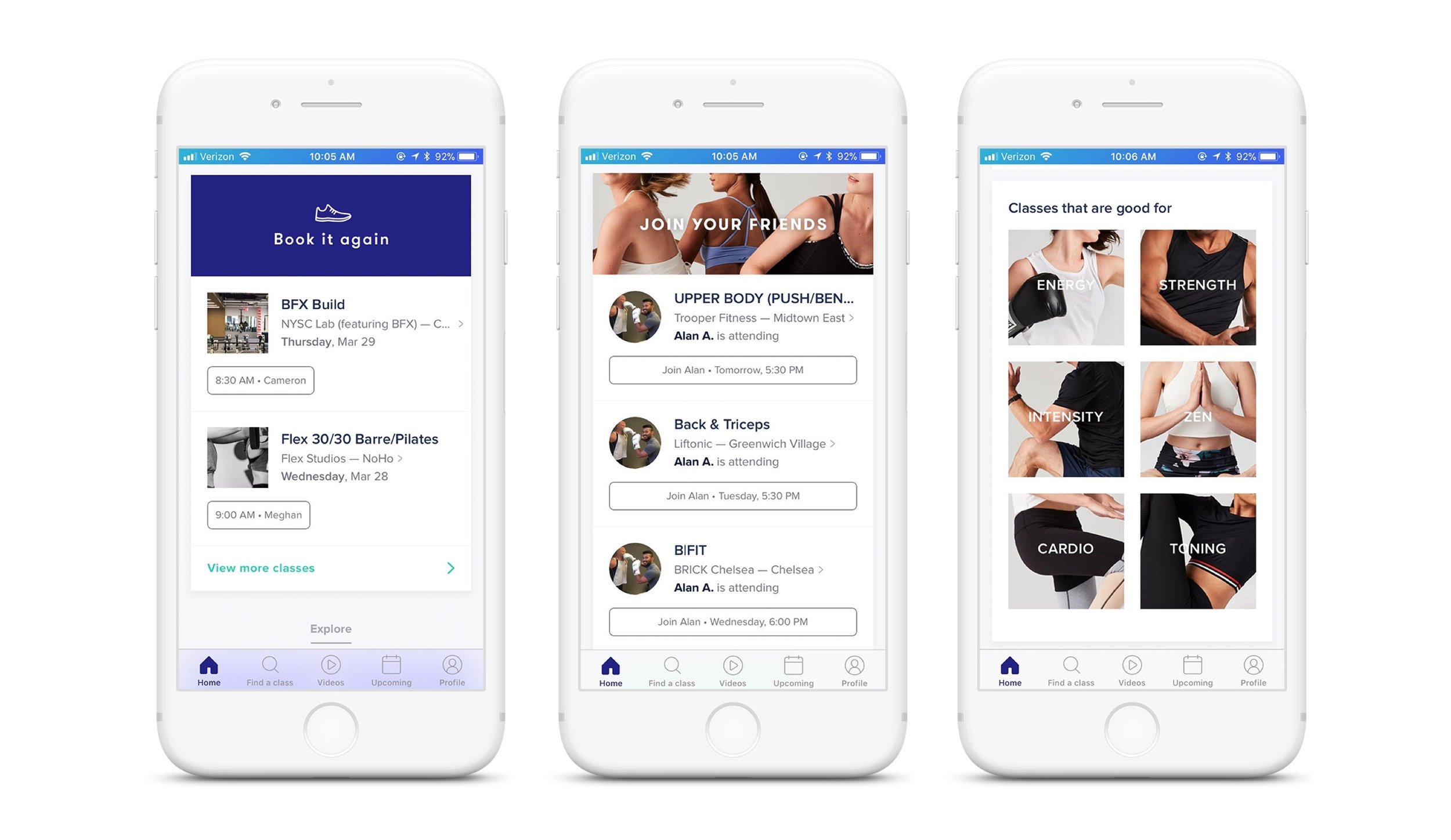
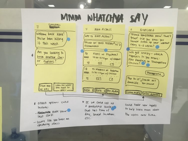
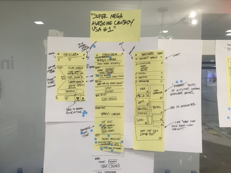
We created a system of cards that combined promotions from ClassPass, class collections based on mood, promoted studios, and then a suite of cards based on the users actions.
-
we treated this project like a design sprint, so we really got to spend the week going deep and testing fast.
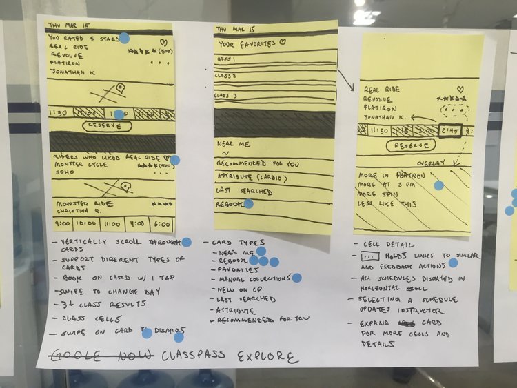
The first step to adding a discovery element into the app was the explore screen. We wanted to test the idea of "workout collections" with our users to gauge interest in curation. Prior to this, ClassPass was a single action based app, you would open the app to book a class from a studio you like and then close the app. We wanted people to start trying lesser known studios.

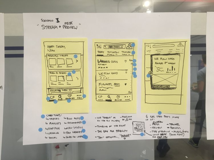
We spent a lot of time looking at other apps with 'home feeds' both in the fitness and lifestyle realm. We found that apps that had dynamic search, large, professional category photos, and dynamic lists were resonating with us the most.
For our MVP we launched with 8 "playlists" for users to explore, mixing "I want to feel x" with recommendations based on classes or studios you've already attended or favorited. Unsurprisingly, we still saw people gravitating towards the playlists that were directly based on their actions, so we got started on V2.
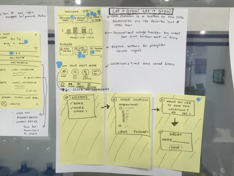
The next iteration of our home feed began by brainstorming into how might we remove the friction of having to click into a collection to search and book classes. based on common user behavior, we created 3 buckets to design into.
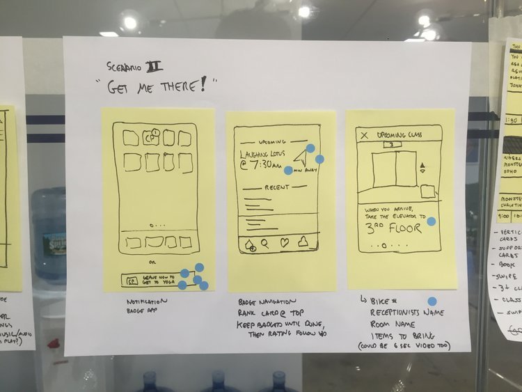
first, we knew most people were searching for classes between a point a and b (usually between home and work) so we needed to explore easier ways to visualize this journey (like maps)
next, we knew that people liked group classes because of the energy and positivity of those around them, we needed a way to translate that digitally into the app to make searching as exciting as going.
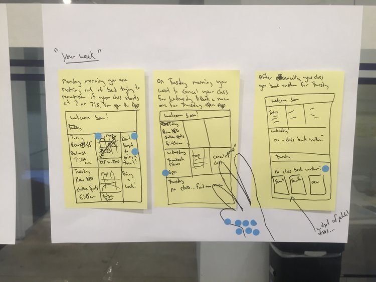
finally, we needed to accept that people had routines for a reason, and we needed to make it as easy as possible for people to rebook the classes that they wanted to go to.
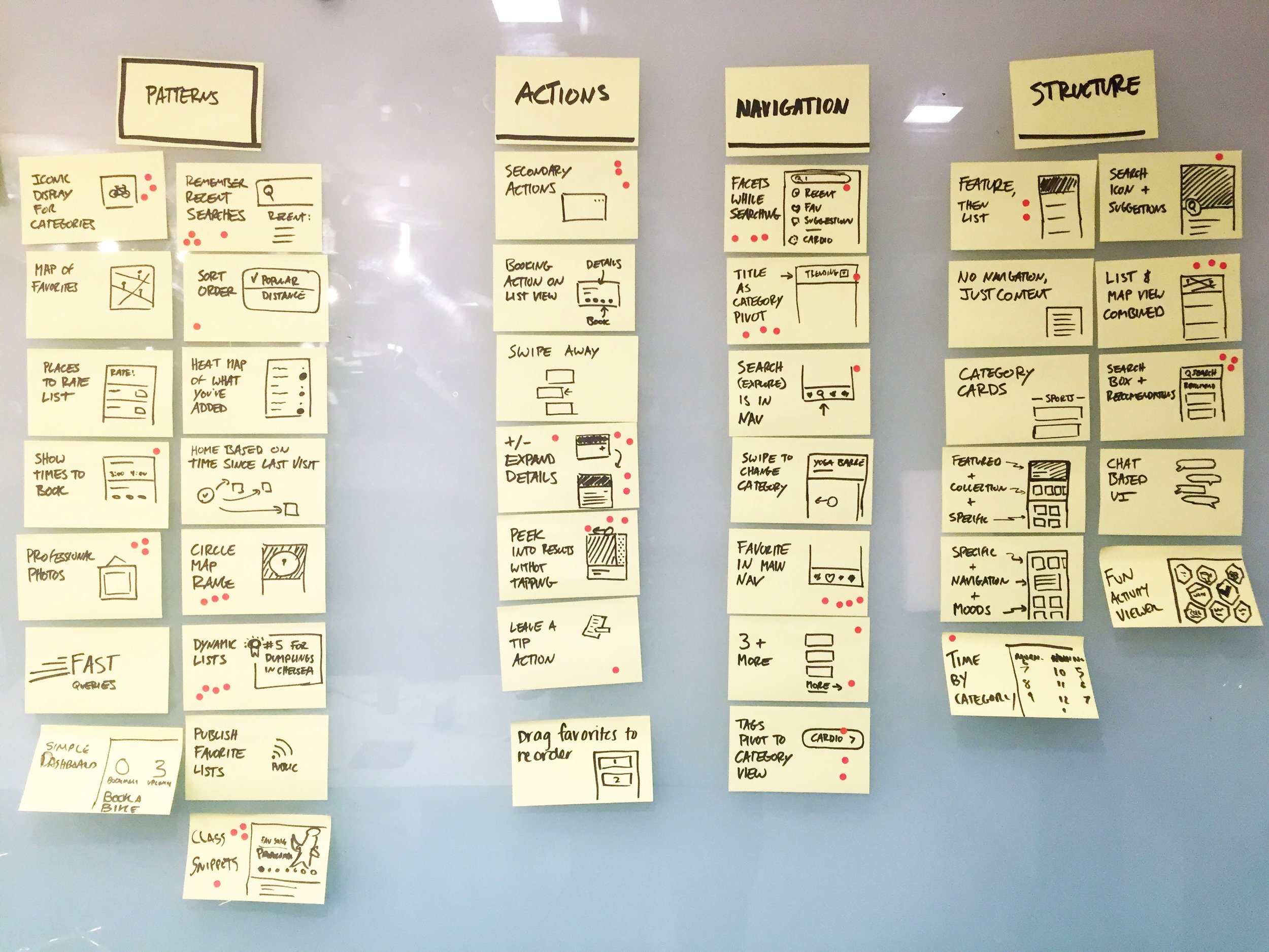
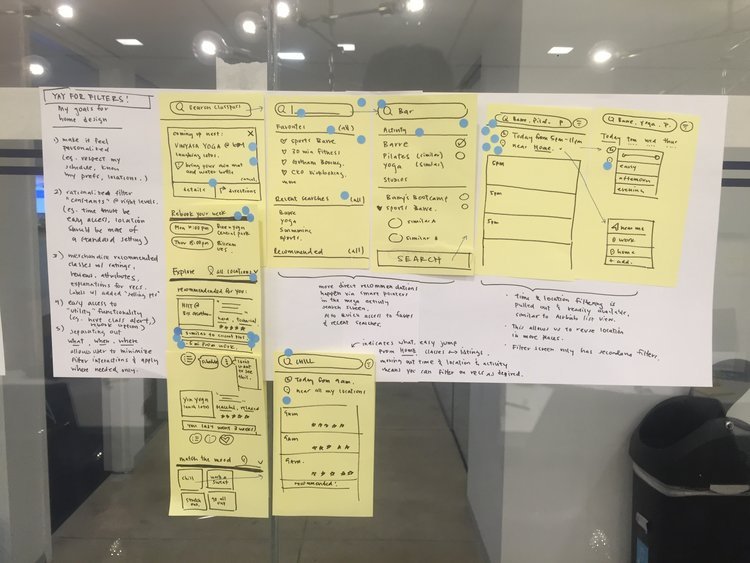
after testing a multitude of cards, we found that people loved cards that showed them new studios by their home or work, classes that their friends were going to, and classes that were 'trending' at the time.
We found they didn't care about integrations like Spotify, Twitter, or Instagram. at the time they felt neutral about recommendation cards from classpass, stating that they would probably click them, but they weren't sure they would take the recommendations unless their friends had gone.
We used these insights to launch our new dashboard, prioritizing card types like book with friends, rebook your favorites, and workout playlists.